Multiple food groups on v1.1

Hello everyone. Menu Plan is just a 10 days old and we’re already hitting the 1.1 milestone. This new version include a couple of features that are definitely worth a minor version bump.
Multiple Food Groups
This one had been cooking for a while.
An Italian reviewer asked for it explicitly, and I had to bit my tongue to avoid disclosing this feature; it was already in on my planned timeline, but unluckily I could not make it to 1.0.
With Menu Plan 1.1, every recipe can have one or more food groups. Say you are making meat tacos. That’s meat plus legumes and of course carbs. Now you can assign all the three groups to your recipe.

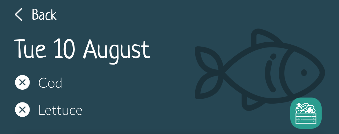
Now you see all of the three groups appear in the day detail header.
This change led to a nice visual improvement affecting all menus:

When you have more recipes on the same meal, all food groups will be displayed.
Needless to say, all computations based on food groups now take into account multiple groups.
Basic iPad support
Menu Plan 1.1 is displayed full screen on iPad.
The iPad porting of Menu Plan has long been on on my todo list, and I want to take advantage of the much larger real estate.
This is just a first step in that direction; no optimisations yet, but now the apps is fullscreen.
Stay tuned for a native iPad look & feel in future releases.
Recent Posts
- v2.70: Reminders
- v2.60: Sharing is caring!
- v2.5: Nutritional Info (Beta)
- v2.2: Backup and safety
- v2.1.4: Dutch
- v2.1.3: Brazil
- v2.1.2: Landscape printing
- Read Me Aloud
- v2.0: Sharing is here!
- v1.71: Muito obrigado
- v1.70: each one his Food Groups
- v1.65: batch cooking here we come
- Goodbye Google Assistant
- v1.63: User requested features
- v1.62: More meals
- v1.60: Alexa, what are having for lunch?
- v1.55: Willkommen deutsche Freunde!
- v1.50: iPad experience
- v1.43: Voici le menu de la semaine
- v1.41: ¡Vamos a planear!
- v1.40: Nothing can stop automation
- Moving a Core Data store without disrupting CloudKit integration
- Print with Menu Plan 1.30
- Import recipes from the web in v1.20
- Multiple food groups on v1.1
- Pending developer release
- Submission day
- Hello folks
Links
Read Me Aloud
For kids learning to readNota ABC
ABC music editor